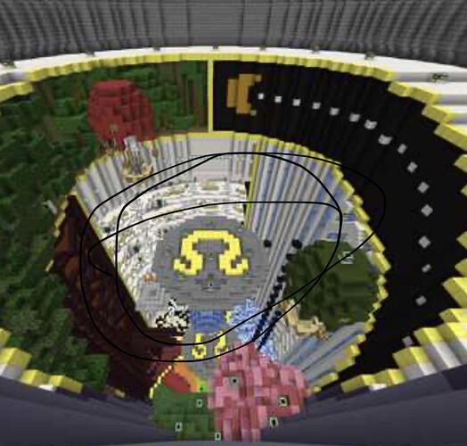
Map details:
A Map that has alot of sections in it, it has alot of my fav maps and other people fav maps.
Map name -
Omega
Max players -
24
Waiting spawn location -
1186 68 2410
Game spawns locations -
Placed
CenterX -
1185
CenterZ -
2412
LowestY -
67
HeightLimit -
158
Parkour material -
Obsidian
Screenshots
https://drive.google.com/file/d/10GqjGGJC8tOXzIlnwzz_WFlEzShIQdr-/view
@Fumaz @TheBoop @Warlock505
5 Likes
i like what ive seen but i think i would need to see some more photo angles to decide if i think it should be a map. +.5
1 Like
Well I’m dumb. This map looks great!
1 Like
The clock is a bit off.
When the minutes hand is past 30, the hour hand has to be past middle of 1 and 2.
1 Like
I’m getting dreamscape vibes, aka ptsd from dreamscape. But great map nevertheless.
1 Like
A mix of a bunch of great woolwars maps. Looks amazing! +1
1 Like
Being honest, I don’t think I would enjoy playing this map.
In my opinion, it’s a little too messy and I don’t like the idea of straight-up copying other people’s creations into one map.
Good luck with your submission, although it’s a -1 from me at this time.
1 Like
actually the only build copied is the rainbow dreams map. the other maps i made them all myself included the coluseum one, and maybe the ufos and the airbaloons
Well I just got destroyed.
But yeah, I like the concept, but I just don’t think I’d personally enjoy playing on this mess of a map 
1 Like
hmmm on screenshots it looks like a mess but download the map to try it and if you dont want to download it dm me on minecraft for ip to my building server
yooo that actually looks dope!
Thats why the maps is called omega and it had difficult to recreate the omega logo and still look good
1 Like
I was saying bc that is the Lululemon logo xD
1 Like
Ah didnt recognise the logo


